
Contributed by Zillow
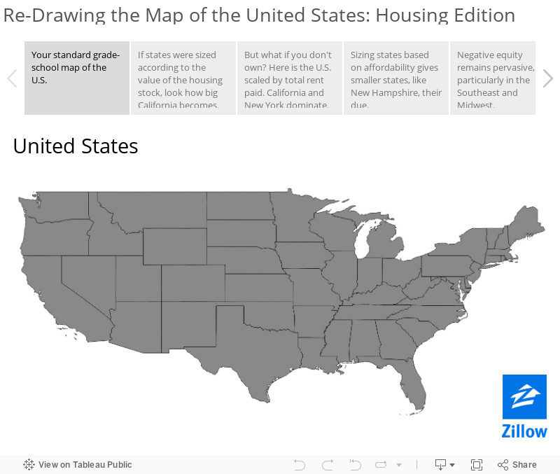
 Any American child is likely at least generally familiar with the standard, decades-old map of the lower 48 states posted in classrooms and libraries nationwide. The twin protuberances of Maine and Florida in the Northeast and Southeast, Texas’ anchor position in the central South and California’s dominance of two-thirds of the Pacific coastline are familiar sights even to the most novice geographer.
But what if the country was re-drawn based not on geography and politically-established state lines, but instead on cumulative home values in each state, the amount of rent paid by tenants or the level of negative equity? What would the familiar map look like then?
Cartograms – essentially distorted maps in which data is used to illustrate the relative size or impact of a given region, rather than simple geography – can be useful in discovering why certain states have more or less impact on the national housing picture.
California, for example, is a large state geographically, but even larger in terms of its relative contributions to the overall value of the nation’s housing stock and the amount of rent paid annually by its citizens. On a map re-drawn along these lines, California’s girth almost swallows its “smaller” eastern neighbors in the less populous, more barren (and, as such, less valuable property-wise) Mountain West states.
Conversely, on a map drawn based on housing affordability, in which the least affordable states appear smallest, California is a mere shadow of its actual self. Here, small Northeastern states like New Hampshire grow in outsize proportion to their actual size, reflecting their relative affordability compared with other, perhaps more heralded neighbors to the south and west.
And when examining states based on how many millennial movers they’re attracting – an indicator of future economic strength as this huge generation begins driving the economy in coming years – the vast middle of the country almost disappears relative to the surging popularity of the coasts.
We invite you to scroll through the images below to change your perspective on American geography.


This was awesome! I love seeing how the map changes with the different housing cost rules. The millennials map was very interesting.